At the end of any data gathering endeavor, one is faced with the task of dissemination. This step determines how the end user consumes the information buried within the data. Often these data sets are complex and require creative strategies to communicate information accurately and effectively. Data visualization is essential for communicating the information in large datasets. One such large dataset pertains to COVID-19 and its impact on various populations across the globe. Seemingly overnight, the COVID-19 pandemic swept the globe and changed our very way of life – leaving us all with daily questions about its spread and impact. How many new cases do we have? Where are these new cases? How many of the patients have recovered? Here, I will focus on the World Health Organization (WHO) situation report and the Johns Hopkins COVID-19 Dashboard to demonstrate the impact of data visualization. Both of these visualizations contain the same information and are updated daily. The lessons learned from this comparison can be applied to scientific journals, which mostly offer static modes of data presentation.
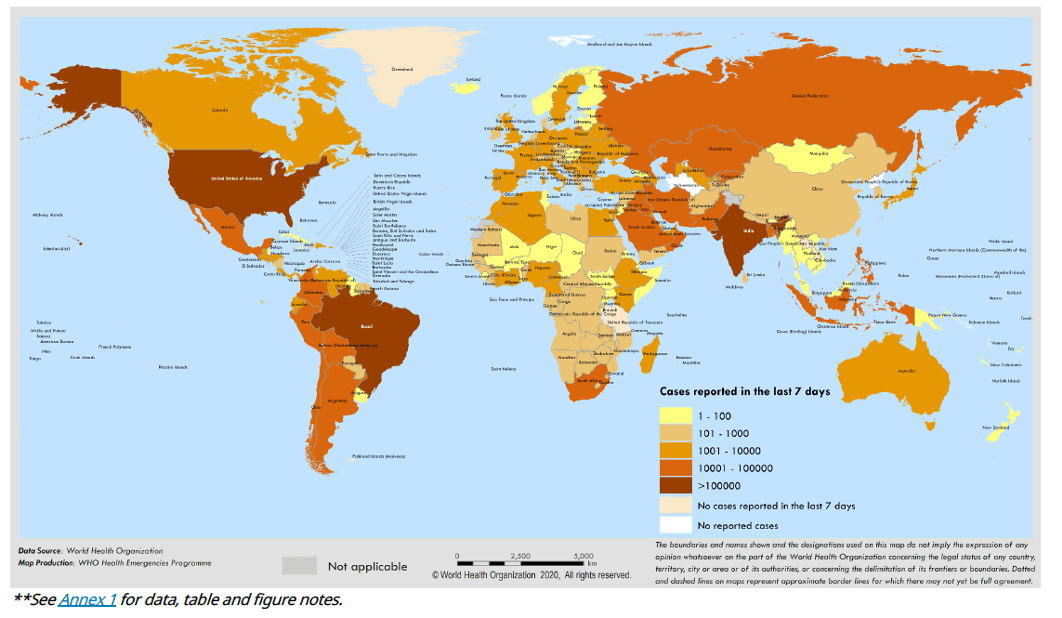
Every day the World Health Organization (WHO) publishes a situation report, which lists the total number of COVID-19 cases and deaths globally and by country. The situation report even contains a global surveillance map (an example is shown below) as well as a plot of the total number of cases by region over time. However, the WHO situation report website does not see as much engagement as the Johns Hopkins COVID-19 Dashboard. According to NPR, millions rely on the Johns Hopkins Dashboard for information on the progression of the COVID-19 pandemic. Also, a free analysis on alexa.com showed an average user engagement time of 2:31 and 2:40 minutes for the WHO site and Johns Hopkins Dashboard respectively. What accounts for this difference in usage?
For comparison, a screenshot the Johns Hopkins COVID-19 map from July 19, 2020 is shown below. Immediately the problems with design and convenience come to light. From the WHO map, you notice that the United States and Brazil are shown in a dark maroon color, indicative of places with high disease prevalence. On the Johns Hopkins map, the red circles communicate the cumulative number of cases and are visually striking due the dark gray background. Furthermore, the design of the Johns Hopkins map allows the user to control what timepoint is shown. This aspect gives temporal information, which is not easily available on the WHO situation reports. However, in the Johns Hopkins site, the user can cycle between active cases, incidence rates and even testing rates. Also, key information, such as the total confirmed cases and global deaths, is displayed on the sides of the map. You can zoom in and out on the map to focus on regions of interest. With these capabilities, users can obtain better geographical insights into the disease prevalence. As such, this versatile map caters to a wide range of COVID-19 information needs. The Johns Hopkins map offers an interactive experience, which encourages users to explore the visualization. Through this exploration, users can unearth unexpected insights. Therefore, it is unsurprising that the Johns Hopkins map has gained such popularity. The presentation of information impacts its consumption and even interpretation. Information presented in an unbiased manner is likely to produce diverse interpretations.

In most scientific journal publications, data are presented as static graphs encouraging the reader to arrive at the same conclusion as the authors. Currently, more labs are using sequencing technologies that generate large datasets that often necessitate more complex data visualization methods. Simple graphs can only tell a small portion of the larger story buried in datasets. Using simple graphs to represent these data sets sacrifices the breadth of information, reduces the impact of the data and dilutes the message being disseminated. Thus, many labs are switching to websites to present their large datasets. While these websites are a step in the right direction, incorporating interactive features is key in promoting user engagement – as is evident from the comparison between the Johns Hopkins Dashboard and the WHO situation report websites. Large datasets can be represented in interactive programs, such as Tableau Desktop, to have maximum appeal and impact. This change allows for alternative interpretations on the same dataset. Since all the data are available on interactive websites, negative results can also be analyzed. Presenting both positive and negative results would help combat the scientific reproducibility crisis.
Similar to the WHO maps, static journal publications are problematic and limited in their appeal. First, large datasets are hard to fully represent in static journal publications. Thus, authors are forced to choose a portion of the data to show and thereby impose certain interpretations on the reader. Furthermore, the data from these publications are not presented in an interactive format and have limited appeal. However, we have technologies and visualization modalities that can overcome those limitations. The Johns Hopkins Dashboard demonstrates the power of effectively applying interactive data visualization. Journals and investigators need to push for the use of more interactive modalities to represent scientific data. In the future, the data representation modalities should be a crucial part of the journal publication process.